02 03 04 05 06 07 08 09 10 11 12 13 14 15 16

Mar 19, 2015

Design for Magic Writer. Blog post 6, Design Document

No one ever reads the design document...
The tale of a game designer

Welcome back to another Magic Writer design blog post! This week is the last one and I'll be writing a more overarching post about our teams design document.

I'm the lead designer for magic writer, and in the early stages of our project I was the sole designer. I tasked myself with writing the whole design document and doing all the design work. This turned out to be much harder than expected, and later on we would collaborate on design work both the creative kind and the writing-the-document kind.

This blog's artifact: The Design Document

From Magic Writer concept document

Document from scratch
In the beginning we used a template which we recieved from our teacher in the beginning of the course. This template contained titles to be included and questions to be answered under the titles. The titles were:

States & Modes
GUI
Avatar
Controls
Enemies/Traps
Power-Ups
Level Design
Rules
MDA

From these as a starting point, we started filling out our concept document.

States & Modes
The aim of states and modes is to have a list of every mode/state in your game and how they flow between them looks like.
We do this with a brief explanation of each mode and show the paths they can take. The picture below is used to clear up the flow.

Picture made by Semih Parlayan

GUI
The GUI or Graphical User Interface section of the document should explain what kinds of design is used to deliver information to the player, things like health, score, and ammunition.
Our first edition of the GUI section used this image together with an explanation of each individual GUI part.

Mockup made by Simon Lundgren(that's me)
Originally from Magic Writer concept document

This worked well getting the point across. One of the biggest strenghts of our design document was that we used old mockups with modification to quickly get the design on paper and picture. Later on we also added this picture to show a new design.
Mockup made by Semih Parlayan

Avatar
In the avatar section, you explain what the playable character is and how they behave in the game.
Here we only used the image below and a couple of lines of text to explain how the wizard was like.
From Magic Writer concept document

This section could have more pictures to explain a bit clearer about the details, but I think we managed to get the idea and design through with words.

Controls
In controls you explain how you control the game, simply.
We had this image below and a list of every button.
Mockup made by me

Simple.

Enemies/Traps
In this section you list all details regarding enemies.
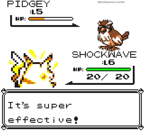
This section is very important in Magic Writer, since our weakness system is a core part of our gameplay. The first iteration had a list of everything about the monsters and then a weakness spreadsheet. Later on we cut the list shorter and added visual representations.

Art by Andre Bengtsson

Power-ups
In the power-ups section you list the powerups in the game and whatever surrounds them.
In this we simple listed every powerup with a image and their effects. Later on we also added the explanation on how their timer works.
Art from Magic Writer Concept Document

Level Design
Level design is here.
In the beginning the only thing we wrote was 5 different ways we could adjust the difficulty and pushed the task to a later date. Later on we realized that no one had done level design and things got annoying to figure out in the midst of programming. Later on when this work was done, the level design was recorded and pushed in.

No image for this one :(


Rules
Rules are for win/lose condition, score calculation and everything extra about the game.
In rules we also simply listed off the things that hadn't already explained or had no better place to be in. This section did not go through any change, since it's pretty straightforward even without pictures.

MDA
MDA or Mechanics Dynamics Aesthetics are supposed to be your design goals.
Here we copied the Magic Writer concept document MDA. They were pretty much on the same page as us.

Summary
This was our structure for our design document. In afterthought, we should have had more pictures from the start. We should also have included an intro paragraph where we explained the gameplay. Other than that, we actually got pretty positive feedback from our design document.

This blog post was pretty rushed, sorry about that!

I hope you liked this tour of Magic Writer design and tune in next week for another design related blog post.

Mar 12, 2015

Design for Magic Writer. Blog post 5, Level Design

Level Design? Who needs it in an endless runner? Well, it's more vital than what you think. The week before the Beta and no level design proved pretty stupid. Let's go through how It was solved.

Welcome to another design blog post for Magic Writer!

Until last week, we had no one working on level design. When I took the task of setting up the wavesystem (making the monster reset after each wave of monsters), I realized that I had no idea what I needed to implement for the wave changing system because I did not know how the difficulty would ramp. Now, this week we've been able to playtest some more, and the feedback went into the level design.

This blog's artifact: Level Design of Magic Writer


The Design Document
In the design document the chapter about level design talks about four "knobs" which can be turned in order to change the difficulty of the game. These four things are the following:
  • Monster Health
  • Monster Speed
  • Monster Spawn Rate
  • Lenght of Words
(Looking at this now, powerups can also be used to change the difficulty. But since it was not considered when making the decisions it is left out for now.)

Monster Health
How quickly a player can defeat a monster depends on the monsters health. This is also relevant because item which crits deals 2 damage, making it more important to choose a fitting amount of health.

Playtesting showed that players did not like increase of health, since they expected to defeat a monster with a certain amount of damage.

Monster Speed
How quickly the monsters can move impact the chaos of the level. If the monsters move too quickly, the player gets stressed when writing items (which can be the intention).

Playtesting showed that the monsters moved too quickly, making it hard to even get past the first level.

Monster Spawn Rate
The spawn rate also effects the chaos level. How many monsters is on the screen at the same time impacts how much there is to keep in mind while playing. Since players have to consider what items has what property to be most effective.

This one is the hardest one to judge. We think the monsters are moving too fast, but that might be because the monsters are spawning too fast. This area is the one who needs more testing to find the right numbers since I think it might be the most important one too.

Lenght of Words
This was a problem we only noticed recently. New players had much trouble with words such as: Hippopotamus and chilipepper. They took the focus away from the strategic planning and weakness gameplay and challenged the player simply to spell the word correctly.

This was fixed by simply removing the hard words. Later we might implement a way to have new harder words come at later levels.

Summary
We had a problem since no one had done level design.
Playtesting showed that people did not want change in health, that the monsters were too fast, the spawn rate needed more testing, and that lenghty words made it hard to get into the game.

I hope you liked this tour of Magic Writer design and tune in next week for another design related blog post.

Mar 5, 2015

Design for Magic Writer. Blog post 4, Controls

Of course I can control my character, it's something unimportant to fix for later. Or is it? Magic Writer's control scheme has went through several changes during development all for users better enjoyment of the game.

Hello there and welcome to another Design blog post for Magic Writer.

During the development of Magic Writer, we've had discussion regarding the control scheme for the game several times. Both teachers and members as well as playtesters have voiced their opinion on the matter loudly. The designers job is to collect all those responses and form a plan to fix this. Let's go through the problems one by one.

This blog's artifact: Design of the controls.

To put some perspective into the controls.

Movement
One part of the group wanted to use the WASD keys to change lanes. But I wanted to use the arrow keys for that purpose.

The argument for WASD was that it was more optimal together when firing items with space. It was also faster to get your hands to after you've finished writing an item.

My arguments for the arrow keys was that it would feel more natural to a broader audience than the WASD keys. The separation of writing(letters) and movement(arrow keys) would make more sense to the player so they could go write->move->shoot, letters->arrows->enter.

Playtesting then showed us that players actually wants to move before they shoot. This made the arrow keys become the permanent choice for movement options for us, since we didn't want to go against something the players was doing naturally.

Shooting
Space or Enter was the big question when it came to shooting.

Arguments for space was that it was closer to the left hand's thumb after writing, which would make it the more optimal way to shoot.

And for enter it was because the letters->arrow->enter would feel better to execute than letters->arrow->space. Also because enter is a more natural choice because people are used to finish writing with enter in chat messages.

This time, playtesting showed us something interesting. Half the players would try and use space and half the players would stick with enter. After keeping enter and later discussing the descicions with our teacher, we decided both buttons would be able to shoot items. So a player could stick with the option he/she was most comfortable with.

Summary
Problems in the controls of our games sparked discussions in our group which brought out different opinions from the members. Later on, playtesting revealed what worked and what didn't work. From there we took decisions which would be the most intuitive to a first time player.

I hope you liked this tour of Magic Writer design and tune in next week for another design related blog post.

Feb 26, 2015

Design for Magic Writer. Blog post 3, The ever-moving focus

The information players can gather from the screen is very important. It's extra important in a game of stress where they need to know the situation at just a glance to be able to plan their next move in time. It's time to give them that information.

Welcome back to another Magic Writer design post.

One issue which came up in a recent discussion with our teacher and senior was the focus of our game. And when I say focus, I'm talking about visual focus. The monsters in Magic Writer is very eye-catching, but you also need to look at the words at the bottom of the screen and type them correctly.

And thus a problem arises. The game becomes unintuitive to play, since your eyes goes all over the screen during game time. With this, we also realized we needed somewhere to place the lives and score so that the player could easily take them into account when needed.

This blogs artifact: Visual focus in Magic Writer


Early mockup which mirrors an early build

The thought bubbles
The main problems are the thought bubbles. They are statically placed at the bottom of the screen which leads them to becoming uninteresting even though they are supposed to be where most of the game takes place.

The bubbles themselves already fill an important UI function, telling which property the item it holds is of. It does this with a light change of color in the outline.

Progress
In one version, we moved the bubbles to the top of the screen. This was done so the player could write where he/she saw the monsters coming and could plan thereafter. This failed, as people thought the items inside the bubbles represented which monsters came(I think this might be because of the relation to Tetris).

Next, we tried moving the bubbles to the wizard. Since they are thought bubbles, we could make them a part of the game world by having them float around the wizard and maybe even follow him when he changed lanes!


We cannot have the bubbles in front of the wizard since the items go there. Behind him works, but it's still kinda dull. The bubbles does follow him, but they still don't draw attention to themselves. We did one more thing which can't be seen in the picture, but the bubbles are pulsating. This was to make them more exciting to focus on.

The end?
I'm sad to have to end it here, but we still haven't found the right place for the UI yet. We still have 4 weeks to complete the game, and if there is something that's going to keep changing, it's the UI.

The aim for our game is to be pick up and play, and the UI plays a big part in making that happen.

There is also a discussion regarding the lives, score and monster HP which will happen in the future. But right now, the bubbles are the main concern. Which is why I decided to write about it.

Summary
Knowing where the players eyes will be when playing the game is extremely important.
The player needs to receive information about their status and get a grasp of what is happening.
The UI needs to know where the players look before it can be places on the screen.
The iterative process of playtesting is the solution for this problem.

I hope you liked this tour of Magic Writer design and tune in next week for another design related blog post.

Feb 19, 2015

Design for Magic Writer. Blog post 2, Designing the Weakness System

After playtesting and iterating, one thing the team still tries to improve is the weakness system of magic writer. Why is it there and how did we change it.

The high concept of  our vision of magic writer is the the following:
  Scibblenaut meets typing of the dead.


At it's core, magic writer is about writing funny items into existing (Scribblenauts) and having a tactical shooter (typing of the dead) at the same time.

At this point, we're having fun with the basic gameplay. Typing words and throwing them works, but now we're going to expand on that.

There are a lot of ways to go about expanding on the game's core idea to make it more interesting. I'm going to firstly talk about how we did it and reached where we are now and then I'm going to take up ideas we didn't use and our reasoning behind excluding them.

This blog's artifact: The Weakness System

The weakness system

Straight from the concept document on which the game is based came the weakness system. The weakness system was set up in the current fashion:
  • Each items has two properties connected to them.
  • These are either Dead or Alive and Hard or Soft.
  • Meaning a Skeleon would be Dead and Hard and a Panda would be Alive and Soft.
  • Each monster have 10Hp.
  • Each monster have one weakness which is randomized.
  • You cannot see which weakness the monsters have.
  • Items deal 1 damage.
  • And item with a property which a monster is weak to deals 3 damage instead.


The idea of this system was:

  1. Almost every item could be categorized with the properties.
  2. It would create a search dynamic for finding the right property to throw at the monster, making you remember items.


How we changed it and why

During playtesting, we noticed that people had expectancy for what items would have for effect. For example, they thought spiky items would do more damage than soft items and that cold items might have a freezing effect. Due to these observations and testimonies we set out to rework the weakness system so it could fit the game better.

We changed it so that every monster have a unique visual based on their property.
We changed monsters HP to 4.
We changed critical damage to 2.
We changed the properties to Fire, Ice, Dead and Alive.
We changed it so every item only have 1 property.

We reasoned that the previous weakness system wasn't logical enough to use in the game. Even though each item could be categorized, the reason why they would be super effective against monsters were unclear.

The new system aims to make things clearer. All monsters now have a visual look which tells the player which property it is weak against. Together with this, we lowered the HP of each monster to make the game faster since less effort is put into discovering what weakness the monster has.

With changed to monsters, came changed to items. We removed Hard and Soft, since visual representations of a monster weak to only those two did not make sense.

Instead we introduced Fire and Ice, since a fire monster and ice monster have easily understood weaknesses. We kept Dead and Alive since we could create a Dark and Light theme with the monsters. All items now only have one weakness, since there are too few items who have a shared property between dead/alive and fire/ice. This is another reason the monsters HP changed to 4, because it's harder to get an item with the property you need all the time.

Summary

Artifact: The Weakness System

The design:

We changed the design of the old Weakness system to one that would make more logic sense. The biggest one is monsters now have a visual style. This also changed the gameplay into to make it faster.

I hope you liked this tour of Magic Writer design and tune in next week for another design related blog post.

Feb 12, 2015

Design for Magic Writer. Blog post 1, Every Pixel a Message

The First weeks of Scrum has passed. What have we accomplished? Hidden storytelling in design.


Not actual picture from the game. But it looks nice!

Design
The first weeks has passed and Magic Writer is coming along fine.
As the lead designer on the project my first main task is writing the design document, which turns out to be much more work than anticipated. But that part is coming along fine ever since we allocated time for me to do it.

For this blog post I'm going to pic one artifact I've been working on and give some insight on my decisions regarding it's design. Inspired from the "Every Frame a Painting" Youtube channel (https://www.youtube.com/user/everyframeapainting), I tried to get creative.

This blog's artifact: How to tell the story/setting in magic writer.

Storytelling through backgrounds
Every Frame a Painting often talks about what the director decides to put into the frame, and the story implication it brings. Trying to convert this idea into game design would mean looking for a way to sneak in the story without it getting in the way of the gameplay.

Since Magic Writer's gameplay is very focus intensive (spelling words does that). it becomes hard to implement story into the gameplay. So we're looking for different ways to create the sense of a story in the game.

Picture from concept document

Moving the Story
Magic Writer is the story of a wizard trying to save a beach from invading monsters. The monsters (like the ones in the picture) convey the enemies. The wizard conjuring the items shows off the defender of the beach.
But we have currently have no way of representing the people being saved at the beach. Our goal for this time is finding ways to show the people being saved. Let's start looking for ways to include them.

The Main Menu
We have a place the player visits at least once before starting the main game. The main menu! We have a lot of options, but I want to keep it simple but effective.
Mockup of the main menu

The background image can convey the situation with a picture. In this mockup, the monsters are positioned to the left with aggressive looks. In the middle ready to go is the wizard, standing between the monsters and the beach. And to the right, a bit afraid, stands the people.

The placement of the characters are important because when we get into the main game mode the people won't be on the screen. But since we've established that the wizard stands between the monsters and the people, between the sea and the beach, we help the players imagine the people being off screen.

Sound
The wizard and the monsters have sounds. It's a pretty standard thing to have on your enemies and player. But what more can we do with sound as design space?

We can also establish the people by having them make noise. But where is the best place to make some noise? Since we're trying to save the people, it makes sense that they would shout if we failed to save them. So when a monsters pass through and the player loses a life, the screams of the people will be heard. This is good since it doubles as feedback for the player losing a life and make logical sense.

Since this worked well, can we take it further?

What if we can use the sound of the people to double on something else? But what could the people's voices double on?

What if the people cheered when the player hits a monster? That does make sense, since the people are happy that the wizard is succeeding. But that would get annoying fast, and it would get dull hearing it too much.

But what if they only cheered at critical attacks? Now we're getting somewhere! If you've played Hearthstone, then you might know of how this works. When you attack with a minion in Hearthstone, you get a crowd cheer based on how much attack that minion have. This creates the feeling of people standing around the board of the game and being invested in the game through cheering. THIS is what we want to recreate.

A crowd cheering also doubles as feedback for critical hits in magic writer, making this design double effective.

Summary
Artifact: How to tell the story/setting in magic writer

The design:

Our main menu shows an image of the story and setting with an importance of left = monsters, middle= wizard, right = people. When we later turn the world 90*, this relationship is kept with the monsters on top, the wizard in the middle and people below the screen.

Through sound we will keep the illusion of trying to save people from monsters. This is done through screams when the player loses a life (a monsters passes onto the beach) and cheering when the player gets a critical hit.

I hope you liked this tour of Magic Writer design and tune in next week for another design related blog post.

Jan 26, 2015

Start of new course, Welcome to Magic Writer!

The course introduction happened, we we're introduced to Scrum and we've now met our senior mentor who will act as Scrum Master. It's time to start the new project!

Magic Writer!

For this project we have:

Simon Lundgren - Lead Designer (that's me!)
Semih Parlayan - Lead Code
Ara Mohammed - QA
Anders Schultheiss - Lead Sound
André Bengtsson - Lead Art
Marcus Prytz - Producer

As the lead designer on this project I will write the design document and I will try to envision the game and how it will turn out and then convey that to the team.

So! What I'll be posting on this blog for the following 5 weeks are the design decisions I've made during the project. I don't know right now how comprehensive it's going to be, but I'll do my best to make it interesting.

Until next time!